Branislav Bajbár
Product Designer, Innovatrics
Viktor Bielko
Product Manager, Innovatrics
Improving the user experience (UX) in the onboarding process is not about making things look good. Its about getting more customers to happily complete the process. Especially during remote identity verification, if customers dont get clear instructions, they can get frustrated and give up. Innovatrics saw these issues and decided to do the extra UX push that guides customers towards a successful onboarding.
An extra UX pushHow would you feel if someone told you that you failed, but didnt tell you why? If a blunt something went wrong was the most you got as a response. Would you feel frustrated or even enraged? Would you leave and never come back?
Well, thats how your future customers might feel when you promise them a smooth in-app onboarding but fail to help them on their journey to verify their identity with biometrics.
An extra UX push How would you feel if someone told you that you failed, but didnt tell you why? If a blunt something went wrong was the most you got as a response. Would you feel frustrated or even enraged? Would you leave and never come back? Well, thats how your future customers might feel when you promise them a smooth in-app onboarding but fail to help them on their journey to verify their identity with biometrics. If they emerge victorious from the first ID task, you ask them to take a selfie, thinking theres nothing hard about that. What you dont realise is that customers dont know everything you do.

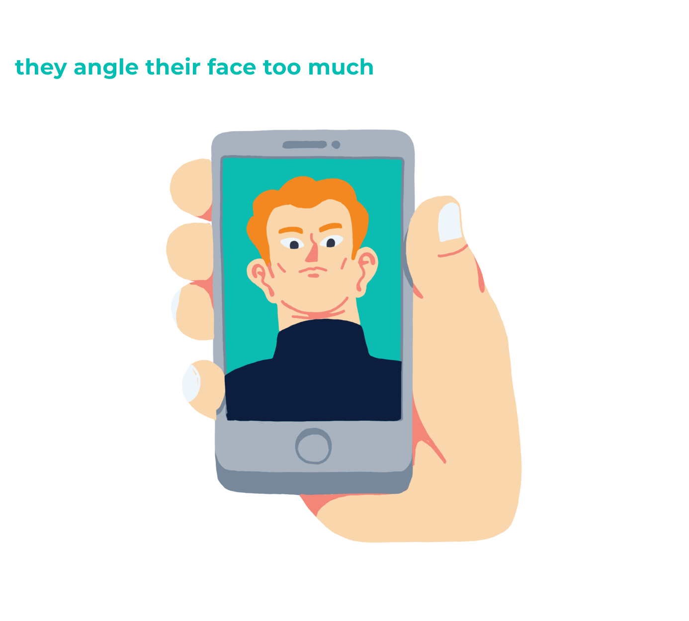
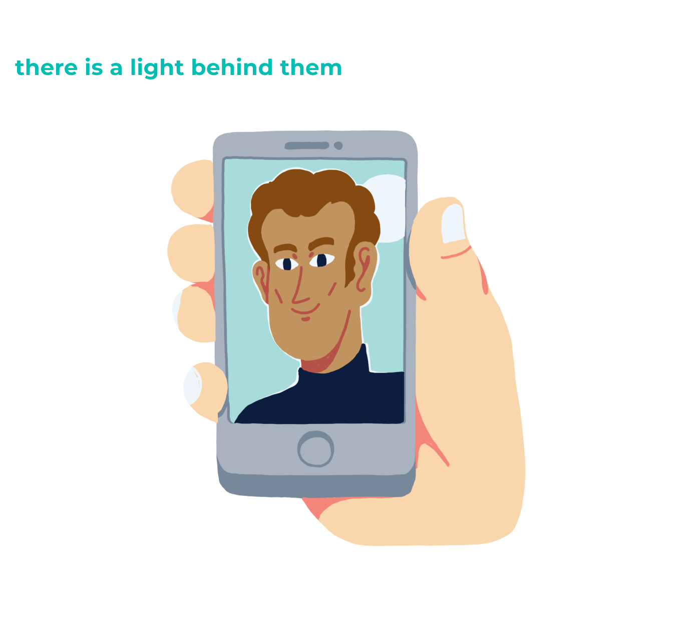
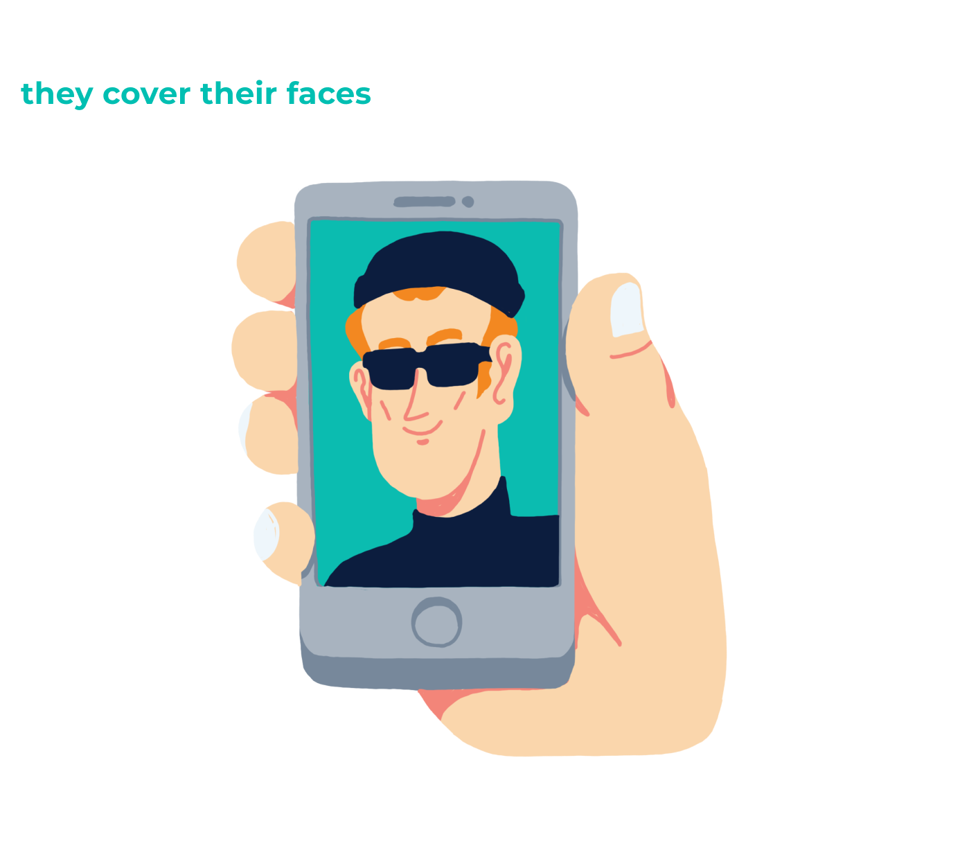
These issues can be a major reason why your future customers abandon remote identity verification while trying to onboard online, and are too frustrated to then ever come back. So what can you do about it?
Walk them through itAt Innovatrics, we noticed these were recurring issues that customers have with biometric verification, and decided to act.
Innovatrics is the biometric partner to many companies who use our solution to verify the identity of their customers in online onboarding. However, even good biometrics will not work properly if the customers dont understand the process. The best solution is to walk the customers through it.
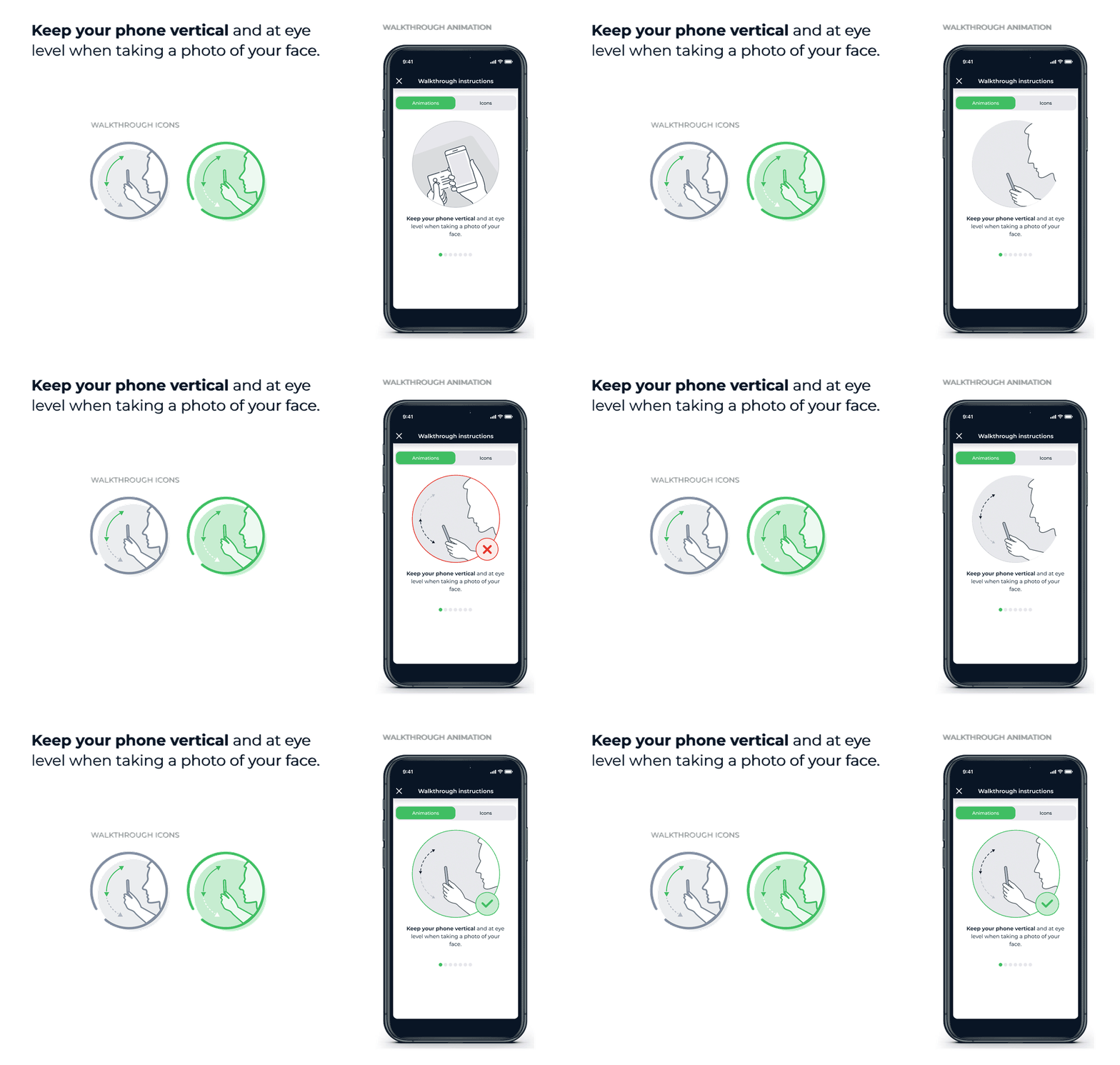
What do the tips look likePeople usually dont like to read instructions. Even our own research at Innovatrics suggests that people turn a blind eye to written guides during onboarding. What they react to are visual aids icons or animations.
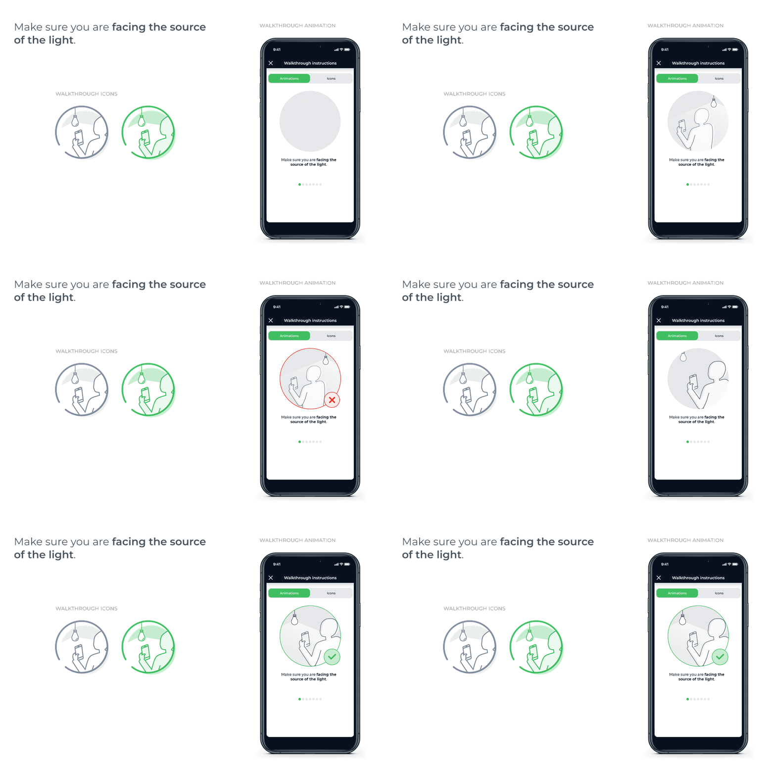
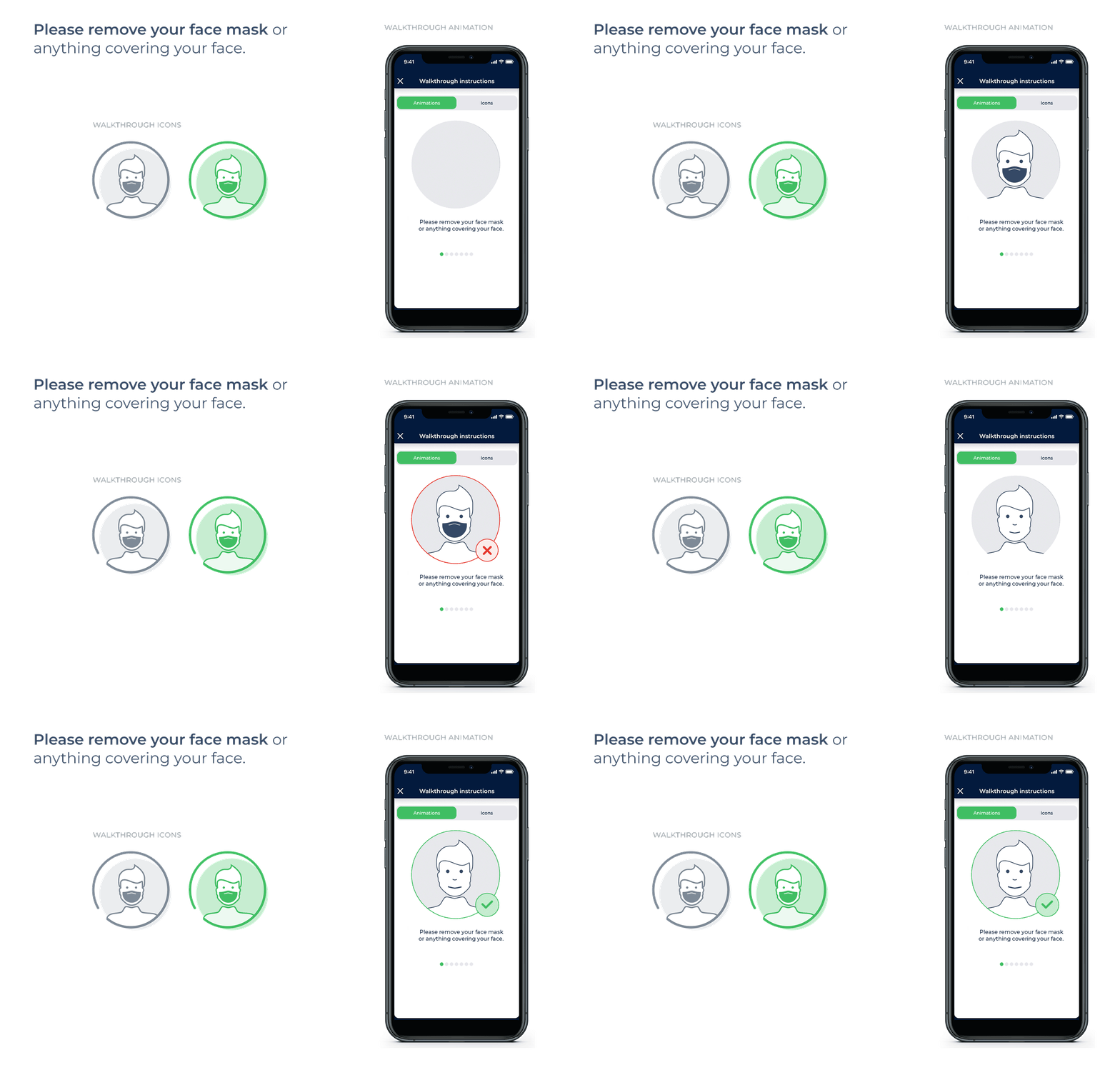
To suit the preference of our partners, we designed the tips using both icons and animations. So every partner can choose which set suits their app best.
While animations can attract attention more quickly, too many can extend the identity verification process. Icons are fast to understand but not as catchy to the human eye. Our partners can still choose to include text alongside the visuals(which we also provide), but they are designed to work without any text.
See for yourself.
Branislav Bajbár, Product Designer at Innovatrics
We created the walkthrough tips a series of instructions tailored to fit the needs of both desktop and mobile devices. Their main purpose? Making identity verification easy for customers, and increasing the number of happy, fully onboarded, customers.
 How many is too many
Initially, we came up with more than 20 walkthrough tips. But wait, isnt that too many and displaying them all could be overwhelming?
Having too much information to handle makes us feel frustrated. If we didnt want the tips to become another information burden, we had to downsize and only work with issues that occur in at least 60% of failed verifications.
Branislav Bajbár, Product Designer at Innovatrics
To make things easier, we categorised the tips based on where in the identity verification process the customer currently is:
Are they taking a picture of their ID?
Good, lets show them the tips for ID verification.
Are they taking a selfie to prove theyre the same person as on their ID?
Great, well show tips for taking a good selfie.
This distinction helped us to integrate a maximum of four tips per use case.
Choosing the right tipsTo create the best possible instructions, we looked at the photos and analysed how many times different issues came up.
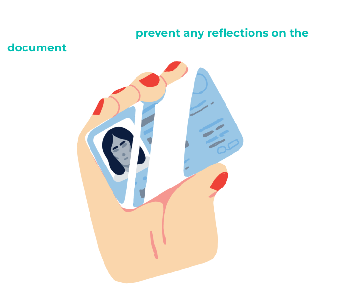
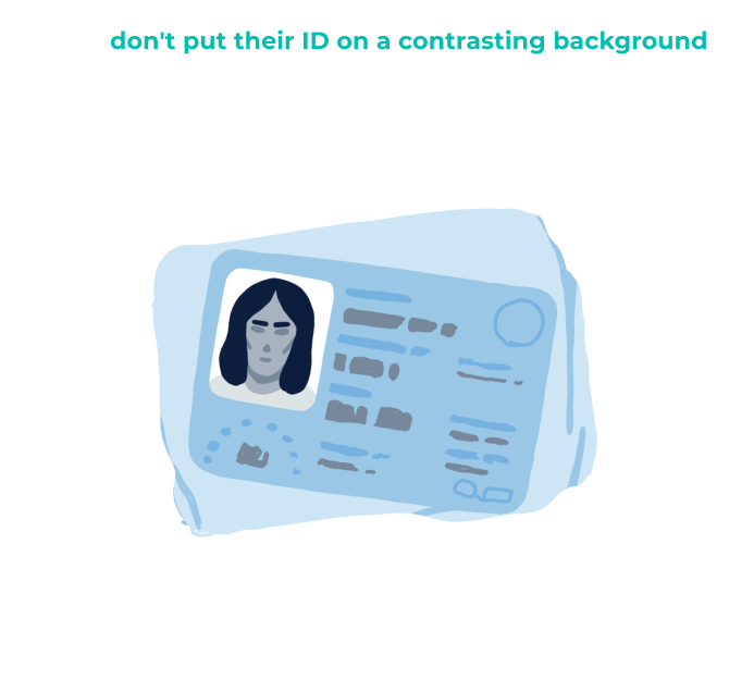
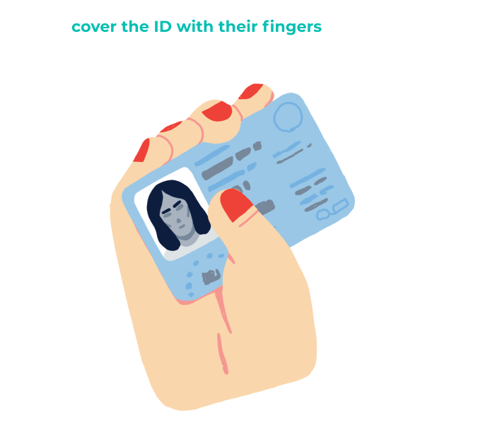
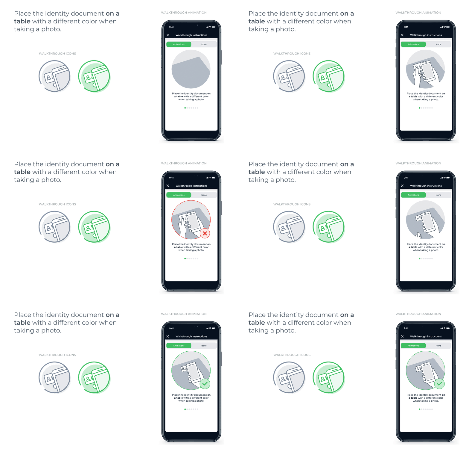
For example, when taking a picture of their ID, we noticed that many customers struggled with bad lighting. To combatthis, we designed a tip that prompts the customer to not hold the ID against the light and to place it on a surface with a contrasting colour, such as a dark table.
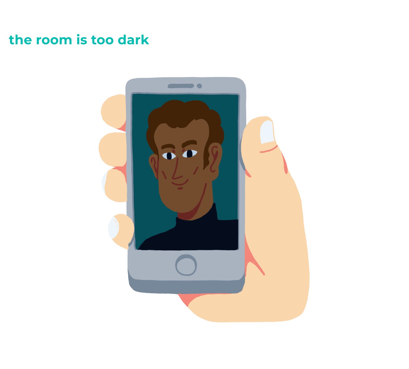
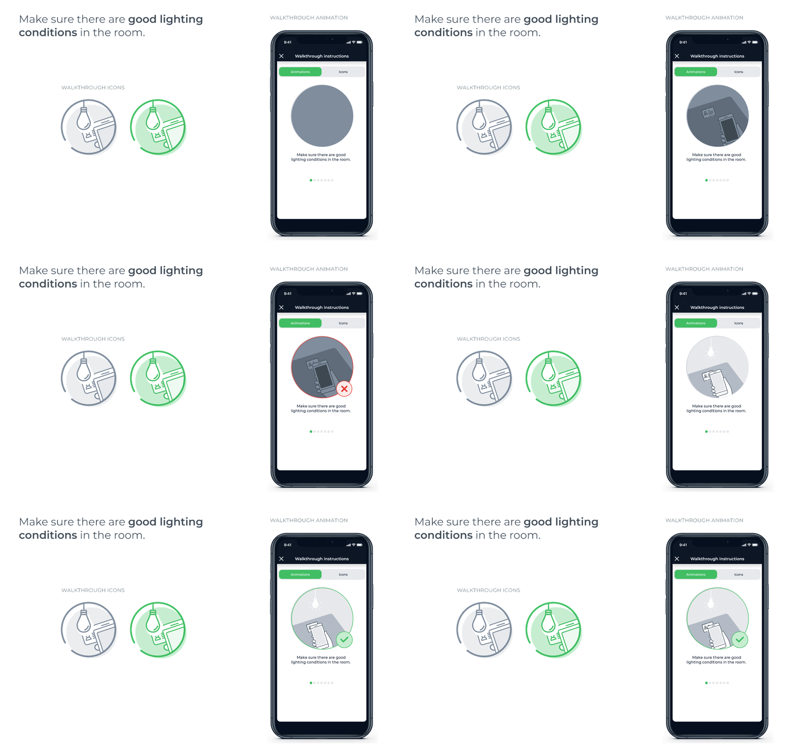
Not everyone is comfortable with taking selfies. Many onboarding customers dont realise that they should turn on the light before taking a selfie or face the camera up front. It may seem obvious now that were talking about it, but many are not used to it and need guidance.
Viktor Bielko, Product Manager at Innovatrics
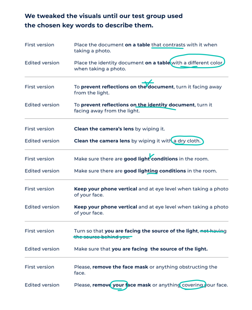
Test test testEven though our goal was to design tips that work without text, we first had to put into words what the customers are going to think when they encounter a problem. To do that, our test group identified the most common words people use when they look at a problem photo.
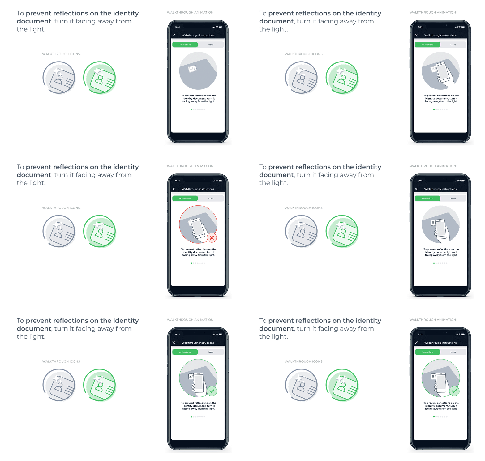
We showed people a picture of someone taking a photo with the light behind them, making it hard to see the persons face. When we asked the group to describe the photo, most of them said that the person should face the light, not the other way around. Thats how we knew that the phrase face the light was important.
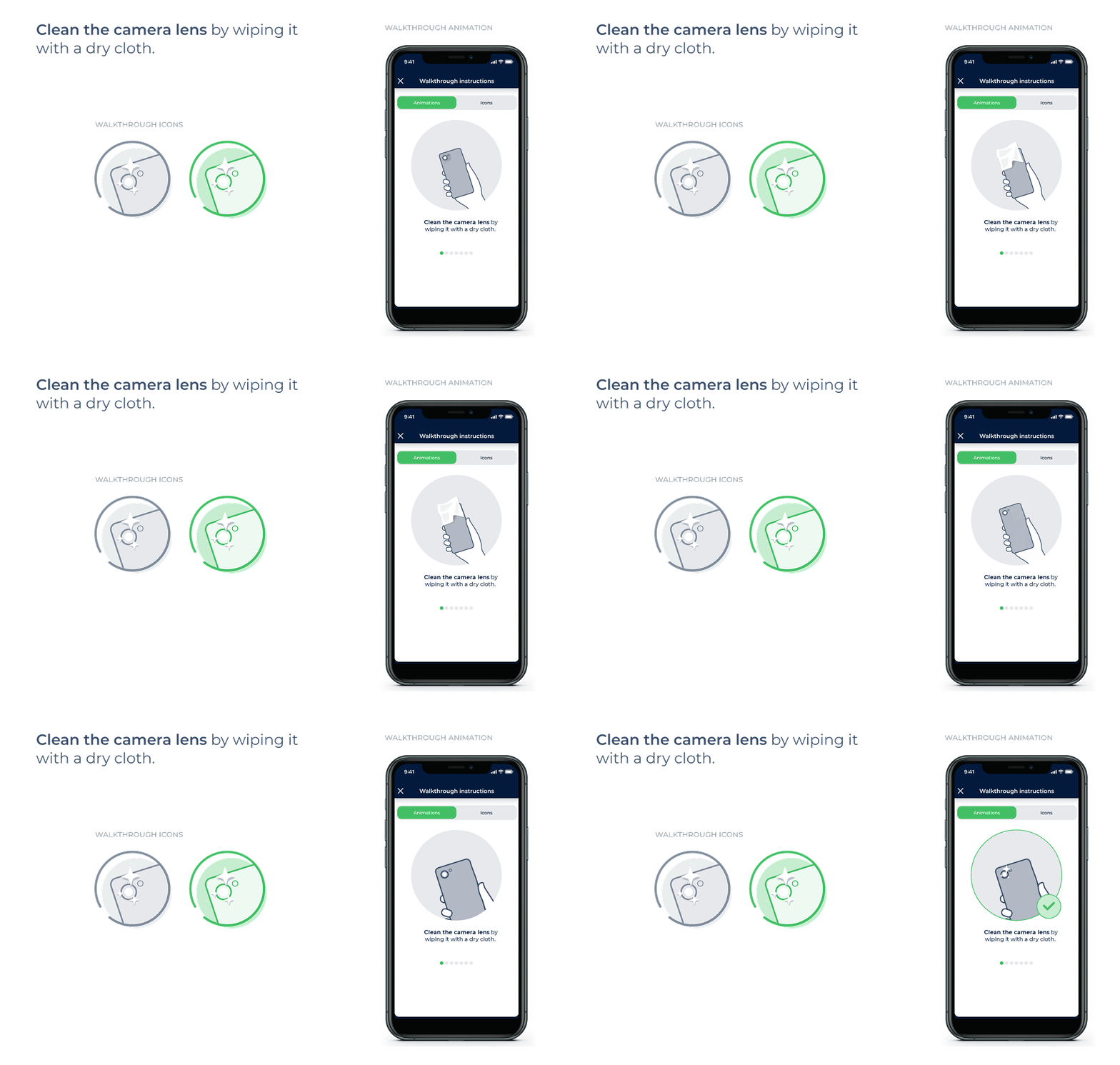
Next, we connected the key words with the visuals icons and animations. The visuals had to remind people of the words they used to describe the problem photos. So, if an icon shows a cloth, phone and a sparkle, the customer will understand that he needs to wipe the cameras lens.
 Smartphone or desktop which one gets the job done faster?
Identity verification takes way less time on a smartphone. While it can take up to 50 seconds to complete the process on a desktop, on a smartphone it can be as fast as 2 seconds. This vast difference can be attributed to working with a webcam when on desktop.
Taking selfies on a smartphone is more natural to us. Also, webcams are often covered or positioned outside the field of view, for example up on a shelf, which makes it difficult to achieve a good angle. Poor lighting and a low-quality camera are not much help either.
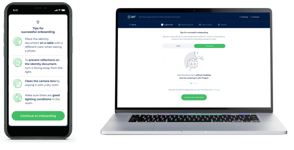
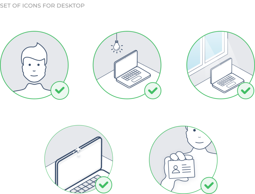
Of course, we understand that some customers may still prefer using a desktop for onboarding. Thats why weve created walkthrough tips for desktop users as well. The same guidelines apply to desktop as they do to smartphone identity verification:
 The grand finale
Our goal was to help our partners simplify their onboarding processes and welcome more customers on board. We did it by designing walkthrough tips for remote identity verification that are easy to integrate and even easier to follow.
We designed the tips because the way we build the UX around our core product matters.
Even small changes that are not technical or AI-based can improve biometric identity verification and lead to more successful online onboardings. Therefore, its important to think about how the customers interact with the process, test it, ask for feedback, and make changes.
Branislav Bajbár, Product Designer at Innovatrics
The final design includes four tips for ID verification and four for face verification both as icons and animations. We added them to the package we distribute to our partners. The walkthrough tips are universal and ready to be used in online onboardings everywhere.
Whats nextWe got the biometric part right. Now weve also done the extra UX push. Can we now expect online onboarding rates to improve in the coming years?
Theres no need to wait that long. One of our partners has already implemented useful UX around remote identity verification and is seeing the results.
By simply guiding your customers with whats best for them to do, you can prevent a significant number of identity verification fails and increase your customer base. This is what 365 bank in Slovakia did. Read their story here or scroll below to check it out.
AUTHOR: Kristína Zrnčíková
ILLUSTRATIONS: Matej Mihályi
VISUALS: Innovatrics
Source: Innovatrics
Original Content:
https://shorturl.at/jFJSW